
+130%
online orders
The simplified buying flow increased the share of sessions that reached completed checkout.
Poze.md had strong demand, but the mobile journey to purchase was fragmented and slowed conversion.
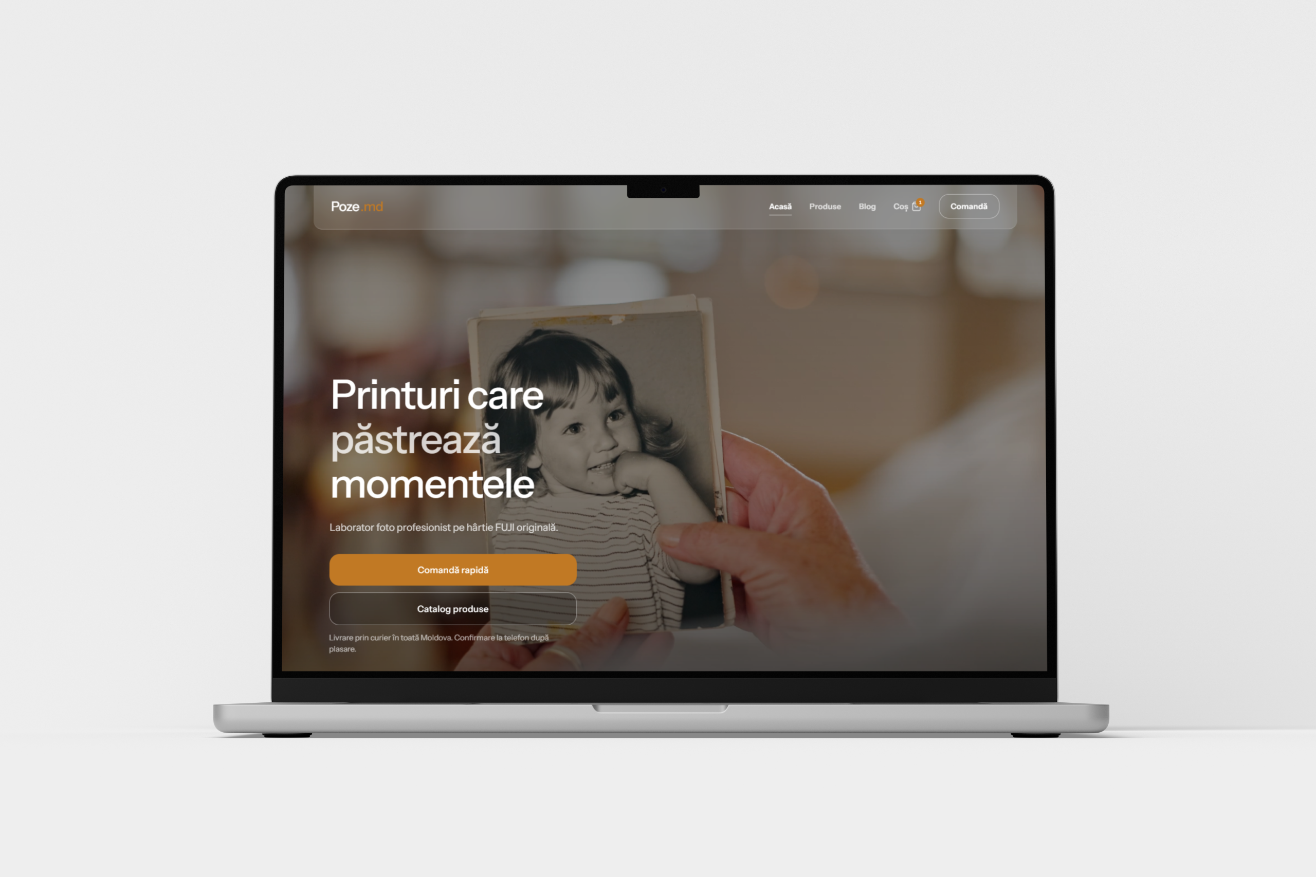
The opening screen prioritizes the fastest route to catalog and order, with clear visual hierarchy.
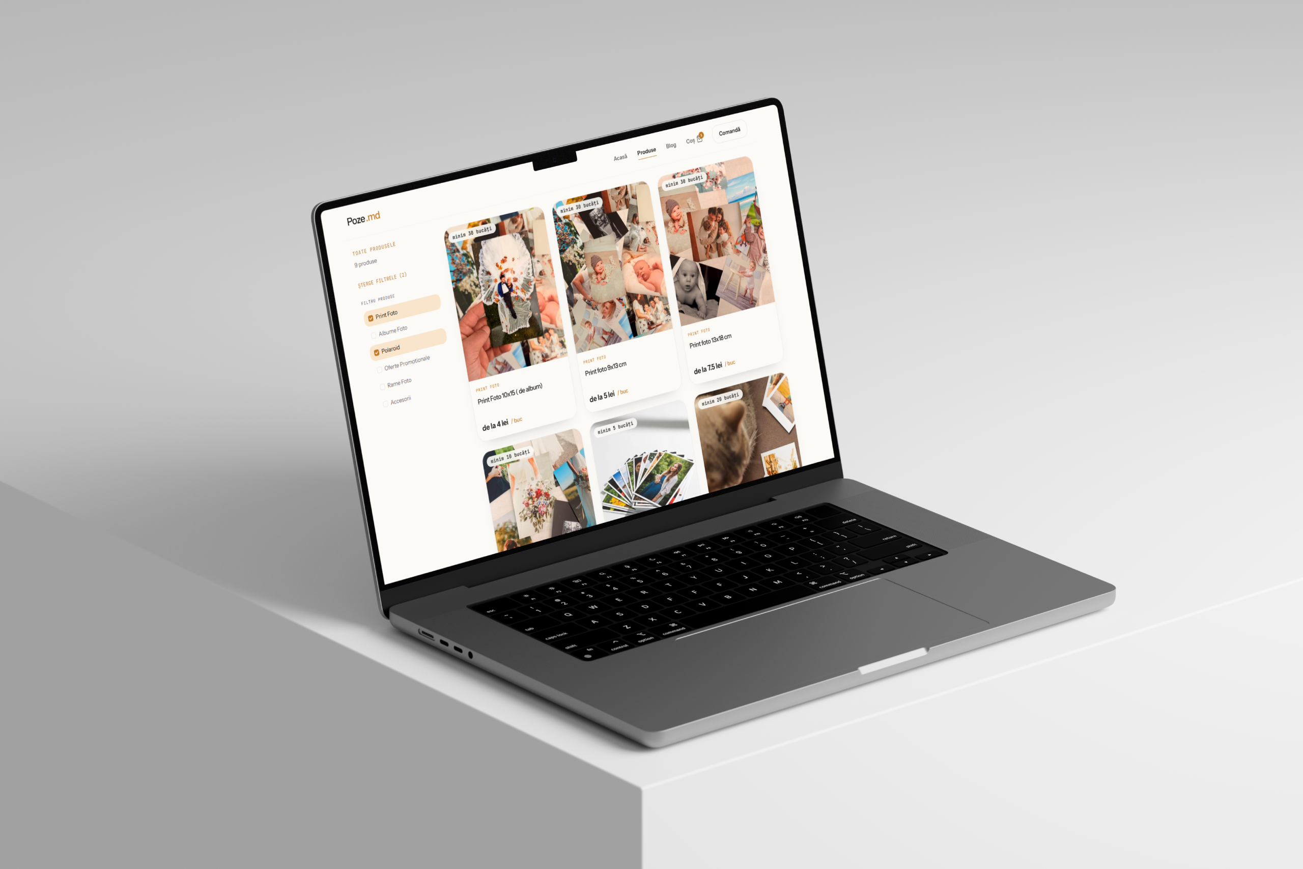
Categories, filters, and product cards are organized to reduce scanning time and comparison friction.
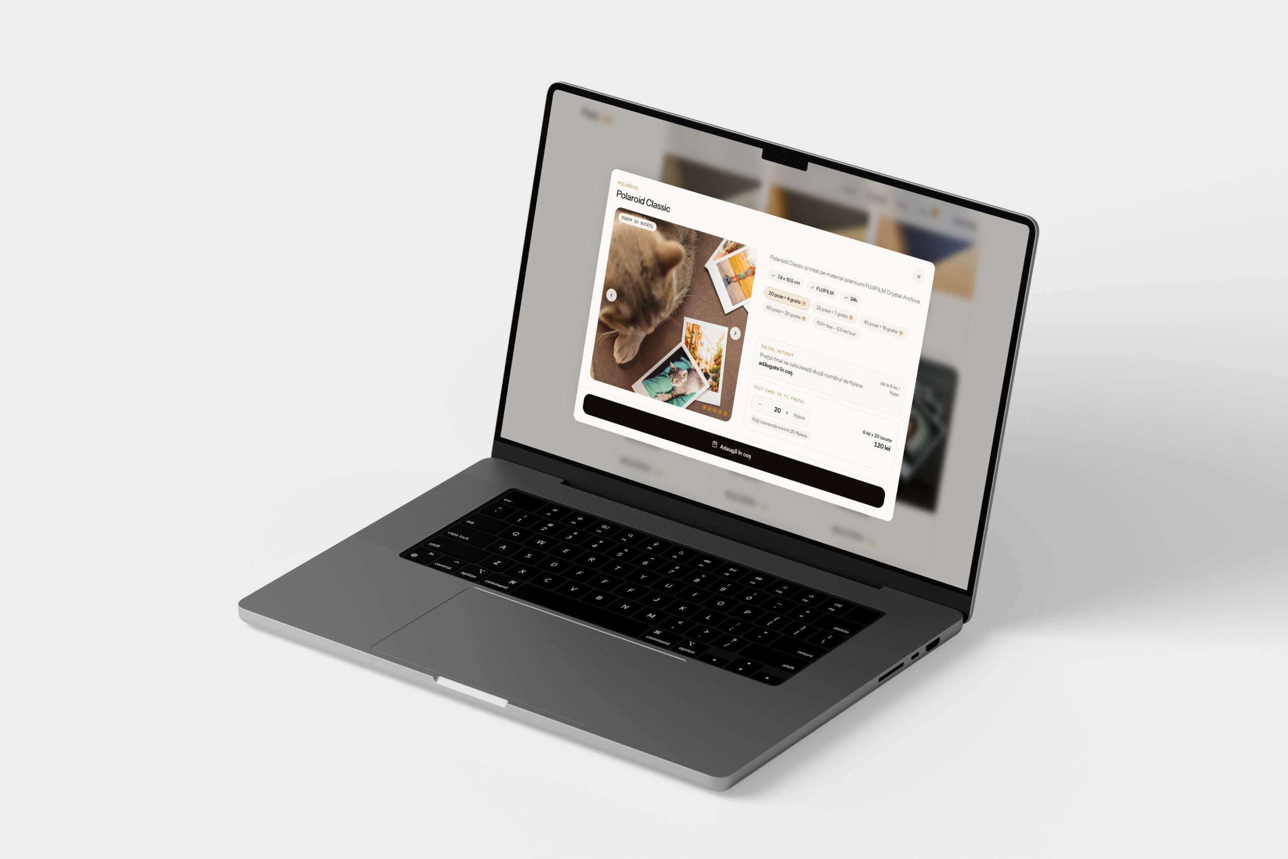
Configuration is simplified into a predictable sequence so users understand choices and move forward with confidence.
+130%
online orders
The simplified buying flow increased the share of sessions that reached completed checkout.
+42%
average order value
Clearer offer structure and option presentation supported higher-value baskets.
-33%
time to checkout
Removing unnecessary steps made the mobile path to purchase materially faster.
StoicScale needed a website that explains complex services quickly and supports sales conversations.
View case studyVelvety launched from zero and needed premium market positioning with clear online sales structure.
View case study