StoicScale: a B2B site built for stronger leads

StoicScale had a strong offer, but complexity in messaging slowed understanding and weakened lead quality.

StoicScale laptop mockup highlighting the homepage value proposition and primary CTA.

Challenge

  • The value proposition was hard to understand quickly for non-technical decision-makers.
  • Page flow did not consistently move visitors from problem to action.
  • Proof signals were present but not placed where decisions actually happen.

Approach / Solution

  • We created a clearer messaging hierarchy to communicate value in the first seconds.
  • We restructured service pages around problem -> approach -> outcome -> CTA.
  • We placed proof blocks and outcomes at high-impact decision points.
  • We optimized content rhythm for fast scanning across desktop and mobile.

Visual showcase

StoicScale laptop mockup highlighting the homepage value proposition and primary CTA.

Positioning clarity from the first screen

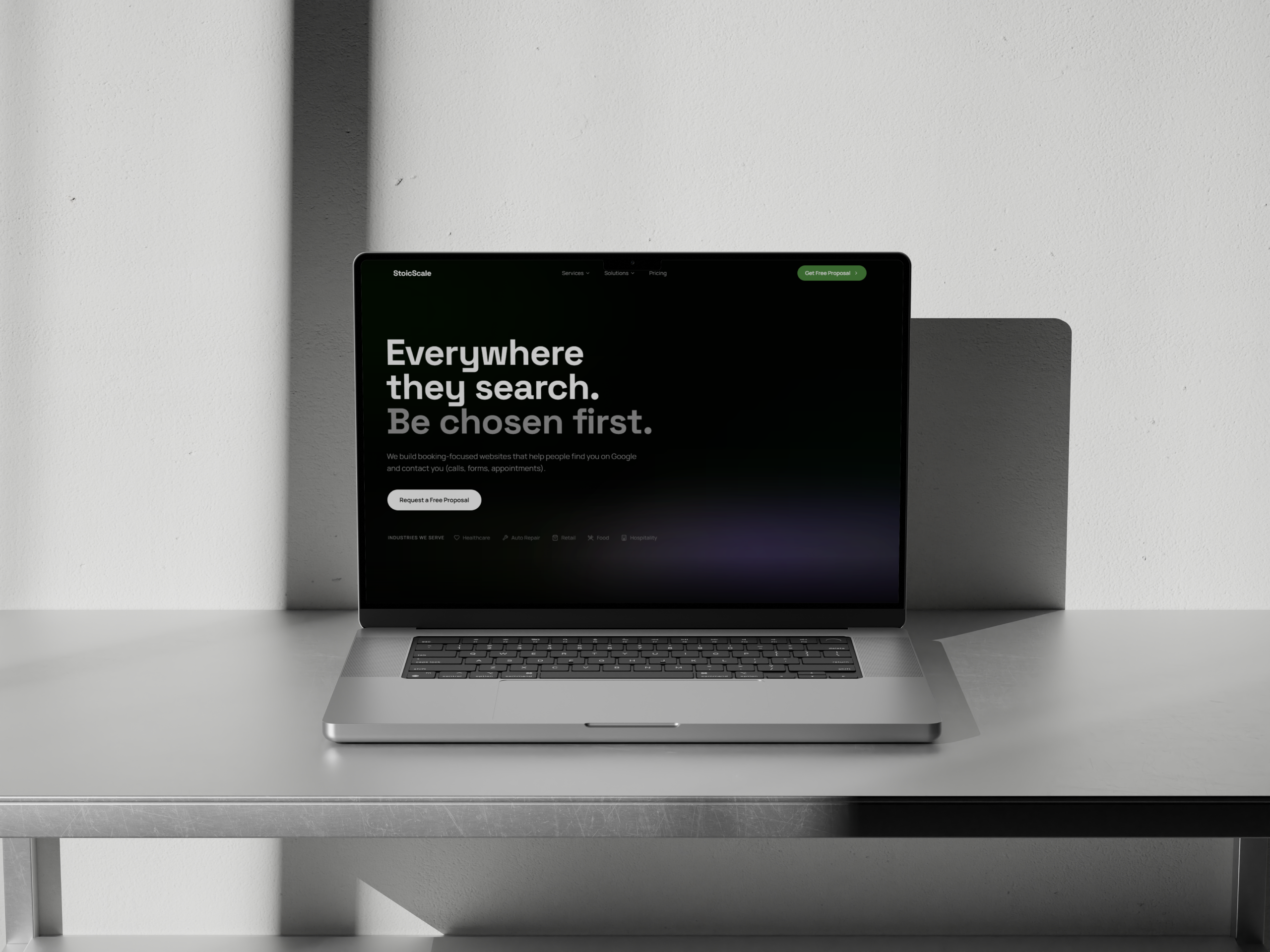
The hero communicates who the offer is for and what outcome it drives before users scroll.

StoicScale laptop mockup showing a product experience section with integrated demo.

Commercial clarity in solution sections

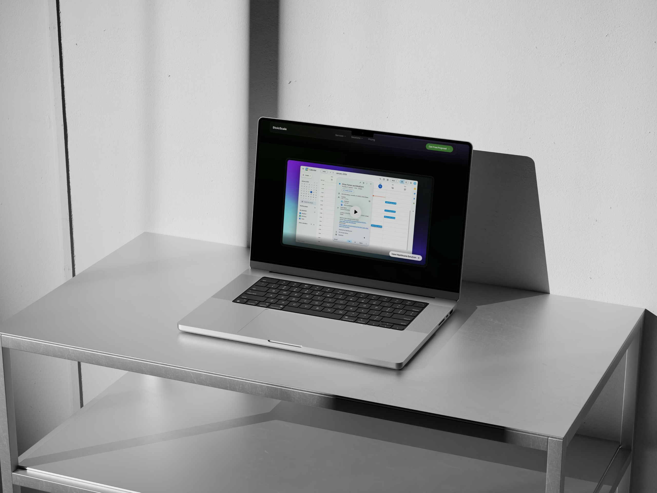
Complex capabilities are shown in a way that supports confidence and shortens explanation time.

StoicScale mobile mockup showing menu, navigation, and footer experience.

Mobile UX that keeps structure intact

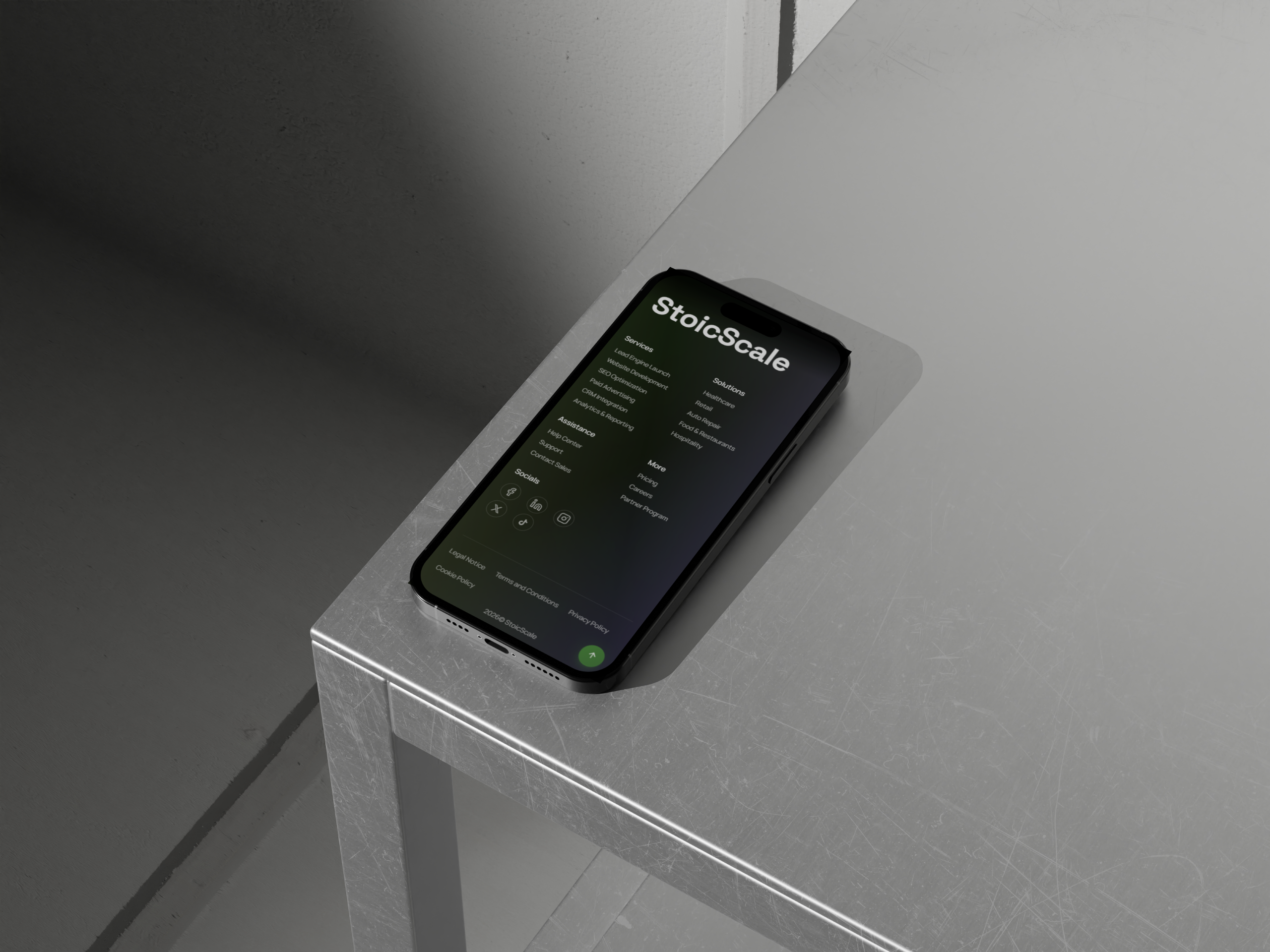
Key navigation and trust cues remain clear on smaller screens where most first visits happen.

StoicScale tablet mockup showing case-style metrics and proof content.

Proof integrated into decision moments

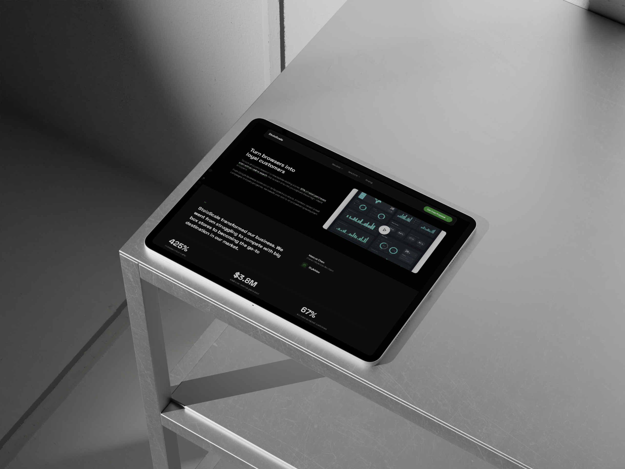
Outcome-driven content appears exactly where visitors need extra confidence to convert.

StoicScale tablet mockup showing outcomes section and portfolio narrative.

Narrative flow built around outcomes

The page structure ties context, offer, and measurable impact into one continuous sales story.

Results

+65%

processes automated

The new positioning made automation outcomes easier to understand and easier to sell.

-40%

operational time

Clearer qualification reduced time spent on low-fit opportunities in early conversations.

+2.2x

execution speed

Visitors moved from first touch to meaningful sales discussions more quickly.

Services delivered

  • Commercial page structure
  • Custom web design
  • Brand messaging refinement

Related case studies

Poze.md

Poze.md had solid traffic but needed a clearer mobile buying flow.

View case study

Velvety

Velvety launched from zero and needed premium market positioning with clear online sales structure.

View case study

Want this level of clarity on your website?